Project Seven
"Weapons do not win battles. Your mind, powerful it is."
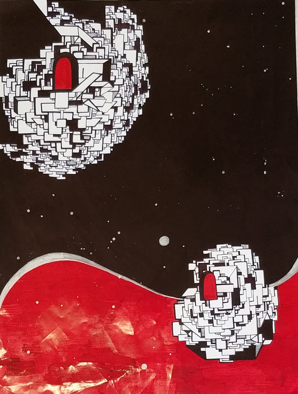
Not The Death Star
Sharpie on Paper
"Weapons do not win battles. Your mind, powerful it is."
Not The Death Star
Sharpie on Paper
Reflection
During this project, I learned that it takes A LOT of layers to make large spaces of black sharpie not look streaky. But I learned how to properly cover it up. I also got better at making straight lines (even though my hand was shaky).
I took inspiration from myself... and Star Wars. Just kidding. It just happened to look like the Death Star, hence the name.
So, like a moron, I basically started the project the day before it was due. Technically I started it on Wednesday, but most of the progress was made Thursday night. I started with the giant sphere in the corner and branched outwards. Once the boxes started to get really small, I moved to the bottom half of the piece and started on a smaller sphere. I then surrounded the piece with black and colored the bottom half red. Then, I used a silver paint pen to separate the two sections. However, when I was using the paint pen, I spilt it and a bunch of silver dots got on the piece. Instead of covering it up, I decided to fling my pen over my piece, adding a bunch of random silver dots. They kind of look like stars. I swear its not the Death Star. The piece has a strong emphasis on shape and direction through the use of heavy contrast.
If I could start over, I would have made my lines cleaner in the beginning so I wouldn't have to spend hours going back over the black section.
It's abstract... mic drop.
