Self Portrait Examination - Sept. 2016
Project One
“Today you are You, that is truer than true. There is no one alive who is Youer than You.” - Dr. Seuss
Do You See The Sunlight?
Digital Art - Printed on Canvas
Addressing the Requirements and Reflecting
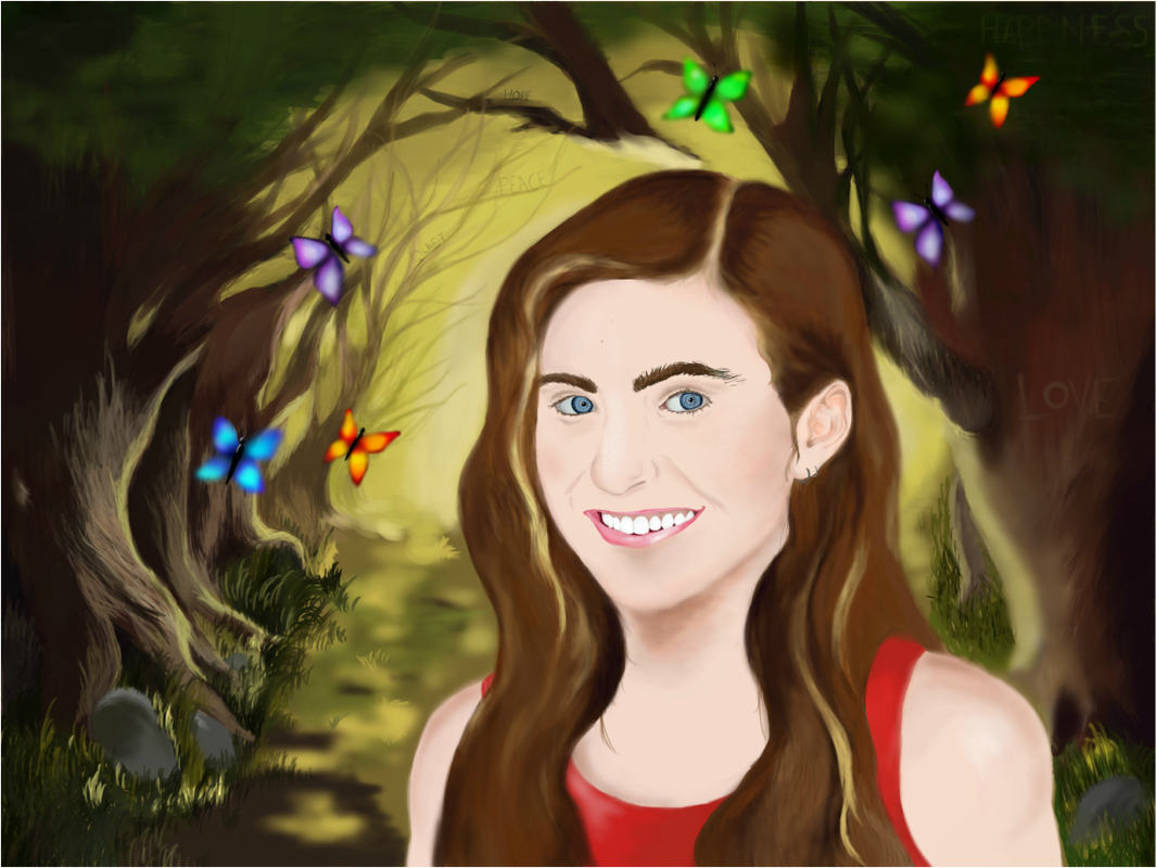
This is my self-portrait and yes, that is me. You know. That thing in the foreground of the piece? You can't see me? Look a little harder ... to the right ... little to the left ... up a little ... Now do you see me? You do? Okay, cool! So, the whole purpose of this project was to reflect on where I am in my life at this current moment in time. Well... I guess I'll answer the question. At this moment in my life, I am making an effort to connect myself with nature. As my mom so often says, I require "fresh-air" to maintain my well-being. Whenever I go outside, whether it is to go for a quick walk around the block or a day hike up in the mountains, I always feel at peace. I feel at peace with myself, with my life, and with the world around me. It's as if all of my stress and negative energy disappears and is replaced with euphoria. It's simple but it's true. Being outside makes me happy. When I'm feeling down, the serenity of nature and it's melodious orchestra always make me feel better, both internally and externally. I am really trying to be more in tune with the world around me. I am working on separating myself from the melancholy of everyday life and just live, peacefully lurking beneath the trees where I can release my inhibitions and just be me.
The element of design that I utilized was shape. The shape I repeated was the butterflies (circular). In the Western world, butterflies are symbols of freedom, fun, and joy. Buy not only are the butterfly's symbolic, the process of metamorphosis is also symbolic of my journey and what I am working to obtain. As a caterpillar, I was very wrapped up in my own issues, unaware of the issues going on around me. I was only focused on myself and that was making me unhappy. But during the chrysalis stage, there was a significant change in my way of thinking and how I viewed the world around me. My mentality and point of view were rewritten; I was writing a novel and when I got to Chapter 16, I decided to start over. I went from being a stubborn and ignorant teenager to a young woman who realized the magnitude of her actions and looked at herself with a new sense of self-worth. And when I became the butterfly, I was able to fully express myself. I was no longer the girl who sat in her room, constantly feeling down and depressed. Now I am the girl who looked at life through lenses of positivity and acceptance. The colors of the butterflies are symbolic of the emotions that are the most prevalent in my life, whether those be positive or negative. When the colors, such as red and purple, are displayed twice, it accentuates how those emotions are more present in my life (red is anger, purple is love, blue is depression, and green is happiness). The second principal of design I used was contrast. I emphasized the difference between the lightness and the darkness, creating a subtle contrast between the two.
For the text in my piece, I decided to incorporate certain words and make them a part of the composition. Rather than just putting a heading or a title, I decided to put the words in my piece, and do it subtlety; I didn't want the text to be too noticeable and take away from the main focus of the piece. All in all, I used five different words: happiness, love, quiet, peace, and hope. These words are all different sizes and placed strategically in the middle-ground and background. The word love is the closest to me. This is because I have always had love in my life, especially from my parents. As long as I live, I know that, no matter what, they will love me unconditionally. I also have friends that love me and appreciate me for who I am. The reason love is in the darkness of the trees is because I am still working towards my own self-acceptance and self-love. The smallest words - hope, quiet, and peace - are all located in the background on branches of the trees. This is because they are all things that nature gives me. When I am in nature, I am at peace. When I am in nature, everything is quiet. The tranquility of my surroundings allows me to deliver into my mind and be with my own thoughts without the constant interruptions of other people. Lastly, when I am in nature, I am hopeful. I am hopeful that everything will get better. The beauty and serenity of nature inspires me to think positively. The last word is happiness, which I placed high up in the tree tops, out of my reach. Happiness is the furthest away from me because my ultimate goal is to achieve happiness in all aspects of my life.
There were a few different ways that I demonstrated changes in depth and field. First of all, my silhouette is located in the foreground. The middle ground is comprised of the beginning layer of trees and the background fades into yellow as the sunlight shines on my back. I decided to make the space around me be in a tunnel formation with the darker trees towards the fronts, symbolizing my struggle for happiness, and the sunlight at the back, representing where I want to go and who I am striving to be. I used value in the trees to make them seem more realistic and to add depth to the scene. I also used color (dark to light) to show how light is coming from the background, so as things get closer to the back, the lighter they get.
Overall, this piece was a struggle for me to create. Since this was my first time attempting to do digital art, while working with and building my ideas, I also had to figure out how to maneuver my way around Fire Alpaca (the free program I used) and how to use my Wacom drawing tablet. I learned a lot from the experience, though. I now feel that I am no longer a novice in the craft of digital art. I'm now an apprentice. I am knowledgeable of all of the tools accessible to me such as different brush types.
There were two artists that I took inspiration from. The first was Cathy McClelland, mainly for the middle and backgrounds of my piece. What intrigued me about her art when I first discovered her was her use of color, texture, and value to create realistic and enchanting wildlife landscapes. Her acrylic wildlife and landscape paintings inspired me to draw a nature landscape of my own, emphasizing, color, value and texture.

Rainbow Valley Farm by Cathy McCelland
|

Singing the Blues by Cathy McCelland
|
The second artist I took inspiration from was from Vincent Van Gogh. What intrigued me about his portraits was the fact that they weren't perfectly realistic. I was also interested by the complementary color contrasts. He inspired me to actually do a portrait of myself that looked like me. His works also made me realize that my portrait did not have to be an almost exact replica of an image or look completely realistic; I could play around with it.

Self-Portrait with Straw Hat - Vincent Van Gogh
The in class critique went very well. In the beginning, I felt very uncomfortable sharing the reasons for some of the decisions I made because they revealed a lot about my internal struggles. It felt as if I was taking a piece of myself and giving it to the two other people who were involved in the critique. I was also uncomfortable because I was afraid that they were going to judge me for my artistic choices, but in the end, my two group mates were very supportive and I was able to thoroughly reflect on my artwork. As we progressed, I began feeling more and more confident. I also felt as though I grew from this experience because it allowed me to really dive into the reasons why I utilized specific components in the composition. I believe that I gained a greater understanding of myself and my inspiration. I received some helpful feedback on my piece, mainly regarding aspects of the piece that they enjoyed, such as the contrast between the light and dark spaces as well as the use of texture and value in the trees.
